Why a Strong Universal Footer Is the Unsung Hero of Great UX (and Better Conversions)
A strong universal footer boosts UX and conversions because you catch high-intent users at the end of a page and give them clear next steps. You offer fast contact paths, doormat navigation, and trusted Privacy/Terms links, so people don’t hit a dead end. You can easily scan with consistent columns, high-contrast labels, and just one or two focused CTAs, such as “Request Info” or a newsletter signup. Keep going to see what to include and what to avoid.
What the Universal Footer Should Do
Why let the footer be an afterthought when it can actively move users forward? You use the universal footer as a high-intent checkpoint to rescue journeys when users reach the end of a page. Give instant access to utility essentials—privacy policy, terms of use, and contact options—so trust and task completion don’t stall. Treat it as a navigation safety net: doormat links let visitors jump sections on long pages without scrolling back to the top, making mobile exploration faster and thumb-friendly. Then engineer for outcomes. Place focused CTAs for inquiries or newsletter signups where attention peaks below the fold; data shows well-placed CTAs can lift conversions by about 50%. Your footer navigation becomes a quiet growth engine.
Universal Footer Anatomy: Layout and Hierarchy
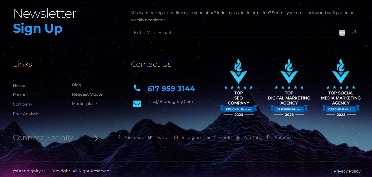
How do you turn the bottom of a page into a clear next step instead of a dead end? You design your universal footer with deliberate layout and hierarchy, not a link dump. Start with multi-column groupings to keep scanning fast, even on long pages. Treat it like doormat navigation: when users reach the end, they can re-orient without scrolling back to global navigation. Keep contrast high and labels accessible so utilities like Terms, Privacy, and Contact remain instantly findable. Then drive outcomes: place no more than two CTAs in the most prominent zone, above secondary items, so you maximize conversions without clutter. Add social icons where users expect them—OrbitMedia reports 72% of sites do. Maintain a consistent structure across pages for trust.
Universal Footer Links Users Look for First
A clean footer layout only works if it surfaces the links people actively seek at the bottom of the page. Start with contact pathways—phone, email, location, and a direct “Request Info” or “Get Support”—so you convert intent while it’s hot. Add doormat-style footer navigation to your top sections and key landing pages, letting users jump without scrolling back to the header, especially on long pages and mobile. Then place social links where expectations already live; OrbitMedia reports 72% of sites do this, and users notice. Finally, anchor the experience with focused CTAs tied to secondary goals—newsletter signup, schedule a visit, or book a call—because aligned footer CTAs can lift conversions around 50% without hijacking the journey.
Policy, Accessibility, and Compliance Links (Footer)
Where do users look when they need the fine print—privacy, terms, accessibility, or ADA accommodations—right now? They scroll to the footer because it’s the most predictable, always-on location across every page, especially on mobile and long-form content. If your Terms of Use, privacy policy, and accessibility statements are easy to spot, you reduce friction at the exact moment doubt can derail trust.
Treat compliance links like performance features, not legal leftovers. Clear labels, consistent placement, and zero broken links signal operational maturity and protect momentum. When users can quickly confirm accommodations or data practices, they stay engaged longer and move forward with confidence. Audit footer links regularly, version policies, and keep them current to support governance and brand credibility.
Footer CTAs That Drive Inquiries and Applications
After you’ve delivered the content visitors came for, the footer becomes your last, high-intent moment to prompt action—so make it count with a focused CTA strategy. Anchor your footer CTAs around one prime universal action, like “Request Info” or “Apply,” and cap the set at two to avoid mixed messages and protect conversions. Place the primary button prominently, then validate it with user research on what people look for at the bottom of key pages. When you align footer CTAs to secondary goals—newsletter signup, contact request, program inquiry—you can lift conversion rates by about 50%. Keep social icons and newsletter prompts in the footer to increase recall and sustain engagement. Use contextual logic to swap CTAs based on page type or user status without cluttering the navigation.
Doormat Footers: When a Bigger Footer Helps
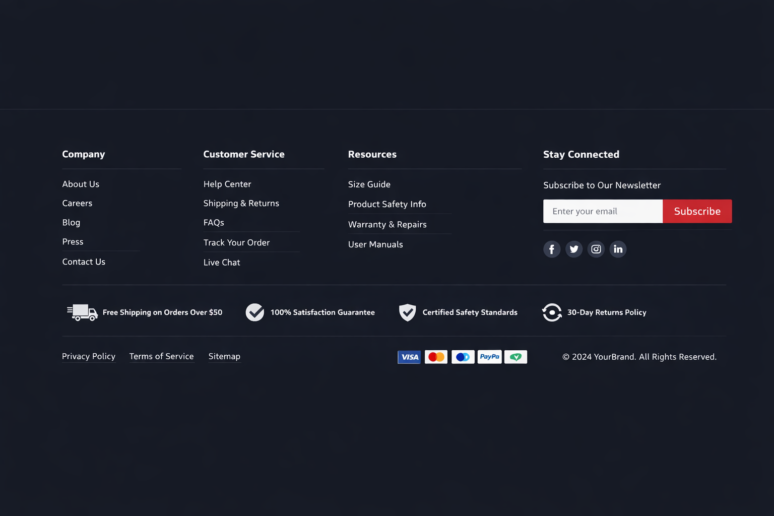
Why force users to scroll back to the header when they’re ready to move on? Doormat footers solve that friction by placing doormat navigation at both the top and bottom of long pages, so you can offer section switching without costly backtracking. When users hit the end of a content-heavy page, they’re primed to act; a bigger footer turns that moment into momentum.
Use it to surface secondary tasks your main nav can’t hold—jobs, investor info, documentation, media kits, affiliates—so people don’t abandon or search blindly. This boosts footer usability by matching near-the-bottom intent: “help me find the thing that’s hard to find.” When done well, your footer becomes a global navigation layer that keeps the flow fast and conversions moving.
Mobile Universal Footer UX: Thumb-Friendly Scanning
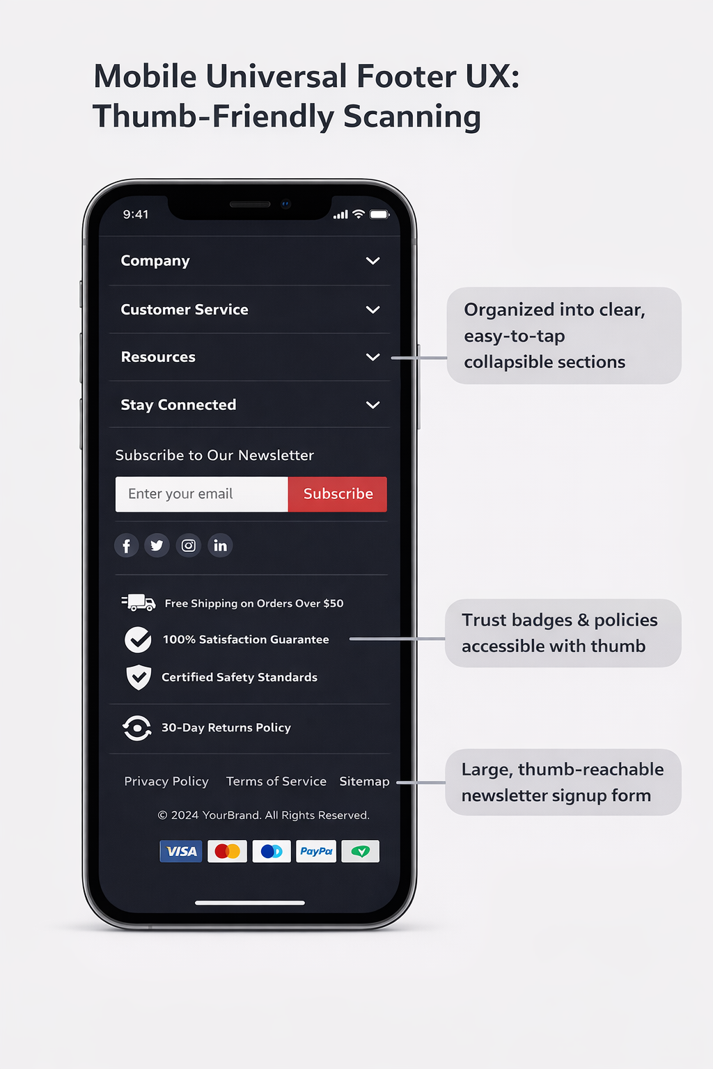
A doormat footer captures intent at the bottom of long pages, and on mobile, that moment happens even more often as thumb-scrolling dominates. When you treat the footer as a conversion surface, you reduce friction for repeat visitors and late-stage decision makers who’ve already scanned the page.
- Stack links vertically so thumbs can tap fast and accurately
- Use clear, legible labels that match the user’s language and search intent
- Keep contrast high for accessibility and instant recognition
- Place one or two CTAs where the scroll naturally ends
- Maintain consistent footer patterns across pages to boost recall
On long mobile pages, this thumb-friendly scanning turns “I’m done reading” into “I’ll take action,” lifting inquiries, admissions clicks, and program exploration without disrupting primary navigation.
Universal Footer Mistakes That Hurt Engagement
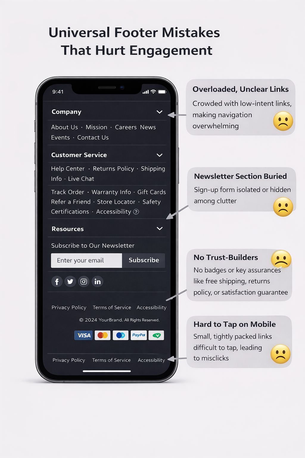
How often do you treat the universal footer like a dumping ground instead of a conversion surface? Chartbeat data shows attention can peak below the fold, so sloppy footer design wastes real intent and user engagement.
First mistake: cramming the full sitemap. You bury priority actions, slow scanning, and make mobile users bounce. Second: keyword-stuffing or endless link lists; readability drops, and UX credibility follows. Third: too many CTAs. A few targeted actions can lift conversions by about 50%, but adding too many options dilutes focus and kills momentum. Fourth: social overload. Yes, 72% of sites place social links in the footer, but don’t let icons crowd out admissions, inquiry, or contact paths. Keep it columnised, clean, and goal-aligned.
Conclusion
When you treat your universal footer like a conversion surface—not an afterthought—you meet people at the moment they’re ready to decide. You make the next steps obvious, reduce support requests with clear contact details, and surface the links users consistently seek: programs, admissions, aid, and policies. You also protect accessibility and compliance without burying them. Audit clicks, scroll depth, and form starts, then iterate. A stronger footer quietly turns late-page intent into inquiries and applications.