When you visit an art exhibition, do you first look at the art piece or the little card with the description? When scrolling through social media, what draws your attention first, the visual post or the caption?
As humans, our eyes and brains first acknowledge and process visuals before they pay keen attention to any written language.
Yes, we are simple folk drawn to the shapes, colors, and depths of things before we analyze text, and that’s exactly how data visualization works to our advantage: by taking advantage of our mind’s affinity to visuals.
We are captured and enraptured by the different shapes, colors, and sizes used to represent otherwise ordinary texts and numbers. It’s like biohacking – well, sort of.
Because visuals are such a core part of communication, this simple guide will detail how to leverage data visualization to create effective and successful marketing campaigns, starting with why data visualization is such a powerful marketing tool.
The Power of Data Visualization
Explaining complex data sets with just words is like trying to eat soup with a fork in the rain; no sane person would do it. Since spreadsheets are the most common form of shared business data, let’s use them as an example to illustrate this idea and the power of data visualization.
Even though spreadsheets are not very visually striking, they are a much-needed data compilation tool. This is especially true because the average Joe can use free tools and comprehensive Power BI courses and resources to learn and master the art of turning spreadsheet data into visuals that powerfully communicate a marketing message. Therein lies the power of data visualization.
In other words, visualized data is so powerful in marketing because if you can imagine data as a tangled ball of yarn, data visualization neatly unwinds and untangles it, making it easy to unravel and understand. It’s like finally agreeing that you need glasses, trying a pair, and seeing clearly for the first time.
The Importance of Using the Right Visualization
Marketing campaigns live or die on the premise of succinctly communicated ideas. Can you guess what we know about clear messaging? Audiences understand marketing messages best when we use tools and strategies that resonate with them, like clear visuals.
Since clarity is king and queen in marketing, we cannot overlook the foundational importance of using the correct visualizations. Analyze your data to determine what fits best. Is it pie charts, tables, infographics, box plots, area charts, network graphs, or geological maps?
Your data determines the type of visualization needed. If you focus on delivering a compelling narrative, the stats will follow naturally; therefore, skip the data dump and craft a story that transitions fans from problem to solution, supported by visuals highlighting pivotal moments.
As a pro tip, look for and use tools that offer all the necessary visualizations and are easy to use, with training for their use.
Additionally, visualized data is a powerful marketing strategy because the human brain processes images faster than text. Think about it this way. Can you compare a high-speed train to a tricycle? Un-visualized data is the tricycle, while visualized data is the high-speed train.
That’s why you should forget dull data dumps; after all, savvy marketers who truly get their message to hit home use visuals that capture and hold people’s attention.
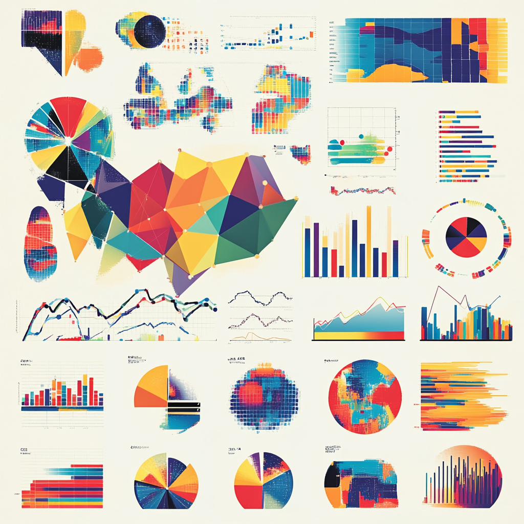
4 Different Types of Data Visualizations To Use In Your Marketing Campaigns
Below are the most common types of data visualization tools you can use:
- Bar charts: Bar charts are the MVP of comparisons. They’re perfect for showing how different products perform or breaking down survey results.
- Line charts: Line charts should be your go-to when the goal is to show trend changes over time. Consider using them to show website traffic or sales changes over time.
- Pie charts: Pie charts are all about proportions. If you want to see who’s eating the biggest slice of the market share pie or budget splits across different departments, pie charts make such data visual, clear, and easy to understand.
- Scatter plots: Do you need to see if two variables are cozying up or drifting apart? Scatter plots are your go-to. They’re great for spotting correlations, like whether higher paid ad spend correlates with higher sales.
Simple, Effective Tips To Help You Use Use Data Visualization For Marketing Success
Even though marketing success is all about experimentation and iteration, here are some tips to help you ace the art of using visualized data in your marketing endeavors:
- Choose wisely: Always choose the right visualization tool for your data.
- KISS: Keep It Simple Stupid. Avoid visual clutter, focus only on the core message, and keep it short and sweet.
- Interactive is the sprinkle sprinkle: Use tools with dashboards to let users dive into the data.
- Narrate a story: Create visualized data that tells a logical, flowy narrative.
- Update, update, and update it some more: Adopt the mindset of constantly refreshing your data and visuals to reflect the current times.
As simple as they seem, these data visualization tips and tools can turn ordinary numbers and words into clear, actionable insights that drive more effective and impactful marketing campaigns.
Conclusion
In conclusion, you now understand that data doesn’t have to be dense, at least not when you can use data visualization, the ingredient that turns complicated data into actionable marketing strategies and visual stories that drive concrete results.


