How Mobile-First Web Design Supercharges Your WordPress SEO Strategy
The digital landscape has fundamentally shifted, and by mid-2025, mobile devices accounted for approximately 64 percent of all global web traffic. This steady upward trajectory in mobile-first browsing behavior means that a website’s mobile experience is no longer just a secondary consideration. For businesses running on WordPress, which retains its dominant position by powering over 42 percent of the internet in 2026, adapting to these changing habits is critical. In today’s highly competitive market, treating mobile users as an afterthought is a guaranteed way to lose visibility. Search algorithms have evolved to mirror human behavior, and since the vast majority of searches happen on smartphones, those devices now dictate how the entire web is indexed. This shift represents a massive opportunity for proactive site owners. Understanding how mobile-first web design supercharges your overall search strategy is the key to capturing modern audiences, reducing bounce rates, and increasing long-term organic growth.
The Mechanics of Mobile-First Indexing
For years, web developers built sites for desktop screens first, treating mobile layouts as a simplified afterthought. Search engines operated similarly, evaluating the desktop version of a page to determine its relevance and ranking. That reality has entirely flipped. Today, search visibility is dictated almost exclusively by how well a website performs on a smartphone.
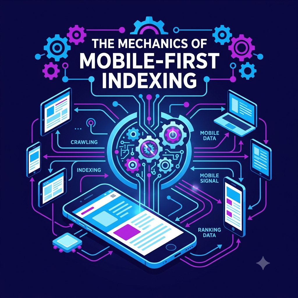
This shift stems from how search engines now catalog websites. According to official Google Search Central documentation, Google uses the mobile version of a site’s content, crawled with the smartphone agent, for indexing and ranking. This standard means that if your WordPress site features an immaculate desktop design but suffers from clunky mobile navigation, missing content on smaller screens, or slow loading times over cellular networks, your overall search rankings will plummet across all devices. The algorithms look at your mobile presence as the primary source of truth.
The stakes are high given the performance gap between devices. Currently, the average mobile web page takes 8.6 seconds to load, compared to just 2.5 seconds on desktop. Search engines recognize this discrepancy and actively penalize sites that fail to deliver a mobile experience that is on par with desktop. If essential text, structured data, or critical metadata is hidden on the mobile version of your responsive theme, search crawlers simply will not index it. Consequently, you lose out on valuable keywords and organic traffic that your desktop site might otherwise secure.
Bridging the Gap Between Design and Search Performance
While a responsive WordPress theme provides the necessary technical baseline for mobile users, scaling long-term organic growth ultimately requires a more comprehensive approach. A lightweight theme ensures your site adapts to different screen sizes, but competing in highly saturated digital markets demands active keyword gap analysis, ongoing backlink acquisition, and high-level strategy. For many businesses, particularly those operating in rapidly growing digital economies, partnering with professional SEO services is the most effective way to elevate a technically sound website into a consistent lead-generation tool.
Consider the rapid expansion of mobile infrastructure in regions like Thailand. As of late 2025, the country recorded 96.6 million active cellular mobile connections, representing roughly 135 percent of the total population due to multi-device usage. Furthermore, with an estimated 33 million high-speed 5G subscribers projected by 2026, local consumers and B2B decision-makers expect lightning-fast, frictionless browsing. The 35-54 age demographic, which accounts for nearly 29 percent of the country’s population, relies heavily on mobile devices for professional networking and B2B research. These users are often researching high-value business solutions during their commutes or between meetings.
If a website is not meticulously optimized for mobile users, it will fail to capture this audience, regardless of its content quality. A stunning WordPress theme might catch a user’s eye, but comprehensive search strategies ensure that the right users actually find the site in the first place. You must view technical design and search optimization as two halves of the same strategy.
Navigating Core Web Vitals on Mobile Devices
Search engines evaluate user experience through a specific set of performance metrics known as Core Web Vitals. These metrics measure visual stability, loading speed, and interactivity. In March 2024, Interaction to Next Paint officially replaced First Input Delay as a stable metric, shifting the measurement focus to the overall responsiveness of all user clicks, taps, and keyboard inputs throughout an entire session. This metric is especially challenging on smartphones, where processing power is limited compared to desktop computers.
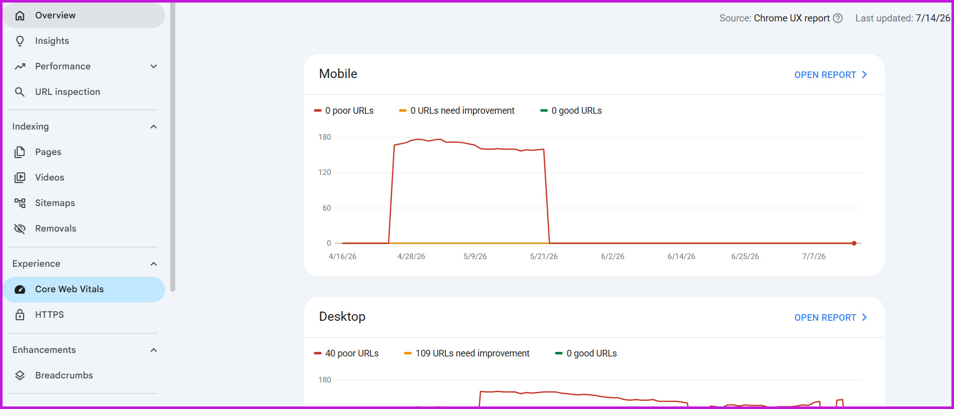
To achieve a good Interaction to Next Paint score, a website must respond to user interactions in 200 milliseconds or less at the 75th percentile of recorded page loads. Unfortunately, HTTP Archive’s recent Web Almanac data reveals that only about 46 percent of WordPress mobile sites currently pass all three Core Web Vitals thresholds. This high failure rate presents a significant opportunity for site owners who prioritize mobile optimization. By resolving these technical bottlenecks, you can easily outpace competitors who are slower to adapt.
Considerable mobile traffic now originates from in-app browsers. Clicking a link within Instagram, TikTok, or Facebook accounts for an estimated 31 percent of all mobile web sessions. These embedded browsers often operate with strict memory and performance constraints. If your WordPress site is bogged down by bloated plugins or unoptimized code, users visiting via social media links will experience severe lag. Browsing a dedicated WordPress SEO category can provide valuable insights into selecting lightweight, responsive themes and plugins that streamline code and improve these critical user experience metrics.
The Impact of Load Times on User Retention
Search rankings mean very little if visitors leave your site immediately after clicking a link. Despite driving the majority of global web traffic, mobile platforms generally experience lower baseline conversion rates than desktop computers. This places a massive premium on frictionless, high-speed user experience design to capture revenue. The moment a user experiences friction, they are highly likely to abandon their journey.
A widely cited performance study indicates that 53 percent of mobile visitors will abandon a website entirely if a page takes more than three seconds to load. When users bounce back to the search results page, it sends a strong negative signal to search algorithms. This suggests the user did not find your page helpful or accessible, which can lead to a gradual decline in organic rankings over time.
Unoptimized media remains the primary culprit behind poor mobile load times and inflated bounce rates. Images routinely account for 50 to 70 percent of the total page weight on median websites, causing severe delays in the Largest Contentful Paint metric. By focusing on mobile-first design principles, site owners can drastically reduce page weight and keep impatient mobile visitors engaged. Every byte of data removed from your mobile site directly improves retention.
Actionable Steps to Improve WordPress Mobile Performance
Implementing a mobile-first design strategy does not require a complete overhaul of your existing WordPress site, provided you are using a modern, responsive framework. By executing a few targeted technical adjustments, you can significantly improve both your search visibility and your overall user experience.
Here are several highly effective strategies to supercharge your mobile WordPress performance:
- Upgrade Legacy Image Formats: Transitioning away from outdated JPEG and PNG files is one of the fastest ways to improve load times. Upgrading to next-generation image formats like WebP or AVIF can yield a 40 to 60 percent improvement in load speeds, directly benefiting your Largest Contentful Paint scores.
- Implement Responsive Image Tags: Ensure your WordPress theme uses the HTML5 responsive attributes. This allows the browser to dynamically download the most appropriate-sized image for the user’s screen size, preventing a smartphone from downloading a massive desktop banner.
- Optimize Interactivity: To improve your Interaction-to-Next-Paint scores, audit your active WordPress plugins. Remove any unnecessary third-party scripts that block the main thread and delay visual feedback when a user taps a menu or button.
- Minimize CSS and JavaScript: Mobile devices possess less processing power than desktop computers. Compressing your site’s code ensures that mobile browsers can render the page much faster, particularly over slower 3G or 4G cellular networks.
- Prioritize Mobile Caching: Implement an aggressive mobile caching policy to ensure repeat visitors do not have to download static assets multiple times. By serving cached pages directly to mobile users, you drastically reduce server response times and enhance the perceived speed of the website.
Securing Your Digital Future with Mobile-First Strategies
As we move further into 2026, the demand for high-quality, mobile-centric web development is more pronounced than ever. Recent search data show that commercial interest in WordPress development has spiked by over 400 percent, reflecting strong global demand for professional optimization and custom responsive builds. Businesses realize that an outdated digital presence is a liability that actively drives customers to competitors.
A successful digital marketing strategy relies on harmony between technical design and content discoverability. A mobile-first WordPress site ensures that search crawlers can index your content without restrictions while providing human visitors with a fast, frustration-free browsing experience. By prioritizing mobile performance, streamlining your Core Web Vitals, and seeking expert guidance when necessary, you create a robust foundation that can dominate search engine results pages for years to come. The effort invested today will yield compounding returns as mobile dominance continues to shape the future of the internet.