Customers can leave your website in seconds for various reasons, but often, a single small mistake on your end drives them away. And this mistake is typically made in the website’s design. If customers appeal to how they interact with your website, it doubles your chances of making a sale.
Today, design is no longer just about aesthetics – it’s the driving force that can let businesses transform casual visitors into loyal customers. So, let’s dig deeper into the power of the right design on your sales.
How Conversion Rate Drives Business Success
The conversion rate, computed as (number of conversions / total number of visitors) * 100, indicates how well your website motivates people to take action. What is important is that a higher conversion rate means more revenue and better profitability. To improve this index, conversion rate optimization (CRO) strategies help get the most out of investment.
Since user experience plays a huge role in converting leads, focusing on UX and UI is critical for CRO. Analyzing visitors’ behavior and interactions with your site and identifying obstacles enables businesses to make data-driven optimizations. Ultimately, companies have better customer loyalty, increased lifetime value, and a strong reputation.
The Power of First Impressions: Captivating Your Visitors from the Start
Making a positive first impression is crucial, both online and offline. Present your customers with a user-friendly and visually appealing site and make them fall in love with quick interactions. A good design choice is a win-win scenario: your users end up happy with seamless interactions, and your business gains more sales.
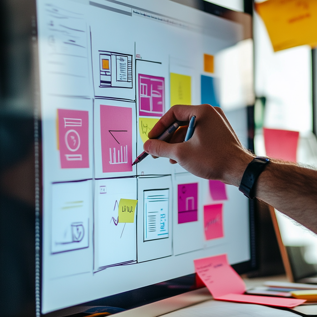
If you’re wondering why yours doesn’t hit, the problem may be that you don’t pay much attention to how your website looks and functions from visitors’ perspectives. So, how does the choice of design impact customers’ willingness to take action? Let’s find out!
Why Looks Matter
The appearance of your website is super important. People form opinions fast, so a clean and appealing design can quickly capture their interest. Eye-catching images and well-chosen colors can make users feel positive and engaged.
How Visual Consistency Builds Trust
Consistency in design helps build trust. When colors, fonts, and styles are the same across your site, it looks professional and dependable. This makes visitors feel more comfortable and confident, leading to higher conversion rates.
The Role of UX Features
“Design isn’t just about appearances; it’s also about functionality,” Steve Jobs once said. Good UX features enhance user satisfaction and engagement. For instance, intuitive menu navigation helps users quickly find what they want. Furthermore, straightforward, concise content and simple-to-fill-out forms make interactions an enjoyable experience.
Moreover, features, including fast load times and mobile responsiveness, ensure seamless browsing on any device. In the context of personalization in the hospitality industry, incorporating tailored recommendations and offers can significantly enhance the user experience, making visitors feel valued and understood.
The Impact of Consistency
Keeping a consistent design creates a feeling of reliability. Elements like logos, headers, and footers should look the same on every page. Small details matter, too, and mismatched styles can confuse users. Furthermore, inconsistencies can make people question your site’s credibility. For instance, if pages look unlike one another in style, visitors might think they’re on several distinct websites.
UX/UI Design and Sale Rates: A Synergistic Relationship
A strong online presence hinges on making a trendy and relatable user interface (UI) and user experience (UX). However, today’s competition makes standing out tough. Besides, the audience’s expectations are higher than ever. So, the choice of UI/UX design can be a dealbreaker. It’s the key to connecting with your audience and driving business growth.
Services like GetDevDone can help with crafting high-quality, white-label web development, ensuring that your design meets modern standards and enhances your brand’s online presence. Let’s break down these two components of a good design that drives sales.
User Experience: Developing Seamless Interactions
User experience covers everything about how visitors interact with a business site. It aims to create products that provide meaningful and enjoyable experiences. The main focuses are on the following aspects:
- How easily and efficiently users can complete tasks on a website;
- Making sure the site works well for everyone, regardless of ability;
- Organizing website content for easy use;
- Ensuring mobile responsiveness for different devices;
- Creating engaging interfaces with thoughtful actions.
Great navigation is key. It should match users’ natural behavior and expectations, making their journey on the site easy and enjoyable. Without one, you may end up with a confusing, slow website that frustrates visitors.
User Interface: Facilitating Intuitive Engagement
The appearance of a website is critical to capturing and retaining consumers’ attention. People form rapid judgments regarding a page’s appeal within seconds of visiting it. The UI comprises everything visitors interact with, such as buttons, icons, and the general design. Here is what is meant by a good user interface:
- Visual appeal, color choices, and typography make the site attractive.
- Organizing elements on the page to create a logical flow and hierarchy.
- Interactive parts like buttons and links that let users take action.
- Using the same style across the site to keep everything cohesive.
A well-designed website increases user trust and comfort. This way, customers are encouraged to remain, explore, make purchases, or join up. Balancing appearance and utility is critical. Overly flashy or complicated designs can slow down and mislead consumers. This inconsistency may lead to dissatisfaction and desertion.
When the design is on point, the page becomes visually appealing, easy to navigate, and consistent. Poor design, however, can lead to mismatched colors, inconsistent fonts, and confusing elements, making navigation difficult for users.
Real-Life Examples of Top Brands’ Winning UX/UI Designs
Many famous brands have embraced the idea that design isn’t just about looks anymore; it’s a critical factor in boosting website conversions. Even small design tweaks can make a big difference in how many people take action on a site. So, let’s look at the real cases of using winning UX/UI designs for boosted sales.
ASOS: A Seamless Registration Process
Many retailers have a problem with people abandoning their carts, reaching a 70% rate in 2024. ASOS has come up with a viable solution by making registration simpler. Instead of forcing users to create an account before buying, they just had them click “Continue.”
ASOS’s experience shows how crucial it is to make your site user-friendly. By streamlining registration, making payments easier, speeding up page load times, improving navigation, and boosting security, you can really improve both conversions and customer satisfaction. It’s all about regularly tweaking your site and using testing and analytics to find and fix any issues to thrive in online sales.
Amazon: Chaotic But Effective Layout
Amazon excels in e-commerce but often frustrates users with its cluttered design. The site’s chaotic layout, with numerous category boxes, tiny images, and constant promotions, can feel overwhelming. And here lies its uniqueness. While seemingly messy, this design is a strategic choice.
Instead of simplifying, Amazon uses the “paradox of choice” to keep users engaged. By offering an abundance of options, the site encourages longer browsing and more discovery. This strategy supports its “everything store” identity and drives sales. While competitors opt for streamlined designs, Amazon’s cluttered layout takes an alternative approach to maximizing selection and engagement.
Additionally, incorporating tools like an open-source password manager can enhance user security, fostering trust and encouraging visitors to interact with your site more freely.
Airbnb: Continuous Improvements in Every Detail
Airbnb’s rise from a modest bed and breakfast to a global powerhouse has been made possible mainly thanks to its design focus. Co-founder Joe Gebbia’s design background shaped their early approach, prioritizing user needs and research.
Today, Airbnb shines in UX/UI design with three main strengths: building trust, keeping things simple, and investing in constant improvement. The team focuses on safety and transparency with features like verified reviews and secure payments, making users feel safe.
Their clean and easy-to-use interface makes booking and browsing a breeze. On top of that, they’re always tweaking things based on user feedback and testing, so their platform stays top-notch.
The Best Practices for Maximizing Sales Through UX/UI
It’s time to learn from the greatest in the design game, taking expert recommendations and suggestions into consideration. Let’s take a look at the proven strategies that can elevate your UX/UI design to drive sales and boost conversions:
- Easy registration. Simplify the sign-up process to enhance user convenience. Use straightforward forms and options such as Google or Facebook logins. For instance, Pinterest streamlines registration with a clean popup and quick sign-up options.
- Visual appeal. Ensure your design is visually engaging and cohesive. Employ appealing visuals and maintain a consistent style. Apple’s website exemplifies this with its clean, minimalistic look that aligns with its brand identity.
- Big, clear product images. Offer large, high-quality images to give customers a clear view of their purchase. Studies show that 30% of shoppers will avoid buying if the pictures are of poor quality.
- Consistent product card design. Keep product cards uniform and organized to provide a seamless browsing experience. A consistent grid layout looks tidy and enhances usability on mobile devices.
- The positioning of customer reviews. Make reviews easily accessible and useful. For instance, Walmart’s review page displays average ratings, the number of reviewers, and feedback segmented by product features.
- Strong CTAs. Design your CTA to be prominent and engaging. Add a person touch by changing the use of the second person to the first person.
With design, even the tiniest tweaks can be a dealbreaker when it comes to conversion rates. Small changes to your website can lead to impressive results. Businesses can see better user engagement and higher conversion rates by focusing on a user-friendly design and interface.
Conclusion
Your website’s design really shines when you focus on what users need, how they behave, and what they like. Remember that UI/UX design is never fully finished and permanently flawless. Instead, it’s all about making continuous improvements. Regular A/B testing and checking how users interact with your site help refine the visual aspect. By investing in these areas and understanding their impact, businesses can create a successful website that attracts visitors and compels them to hit the Buy button.