Top Tips to Improve your Website’s Look & Feel
The way a website looks and feels is crucial to its overall success because it dictates the way its users will interact with it. For instance, a website’s users are only able to navigate the site with the navigation tools that are built into the site. A search bar, which is a component of a website’s feel, allows users to more easily find the exact page they’re looking for. In this way, the feel of the website is quite literally controlling your users’ means of exploring your website.
Improving a website’s look and feel will make it more popular, and by extension, more successful. In this article, we’ll define what the “look and feel” of a website refer to, and what components are important to a website’s look and feel. Then, we’ll give specific tips and considerations you should make when addressing your website’s functionality.
What Do We Mean By Look and Feel?
Look
The look of a website refers to any of its visual components. These components include the website’s font styles, color scheme, images, page layout, and anything else that would fall under the umbrella of visual design. A website’s visual elements are incredibly important because they are the first impression a user will get of your brand. In fact, 94% of people have cited poor web design as a reason they doubted or rejected a website.
Your website’s look should also be in line with your brand’s personality. Let’s take the hypothetical example of a fashion brand that specializes in athletic wear. Chances are this company has an encouraging, active, exciting personality, and its website should reflect that. It should include images of people exercising and feature content that is clearly directed at people who enjoy being active.
Aligning your website’s look with its personality makes it easier to connect with your target audience and grow your brand. It will also improve your brand’s overall brand recognition, meaning more people will recognize your company.
Feel
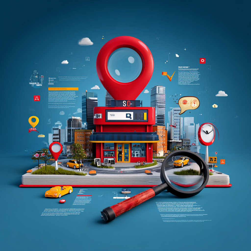
The feel of a website is more concerned with its functionality. The tools used to navigate a website, the speed at which its pages load, and whether or not its design is responsive are all components of a website’s feel. Websites should aim to feel intuitive and quick. If a website is buggy or difficult to use, then it is unlikely to garner much of a following.
Two of the most common barriers to a website feeling well-made are broken links and long loading times. Broken links are links that result in an error instead of redirecting the user to the proper page. These typically occur when a page is being moved, but the incoming links to that page haven’t been updated. The simple solution to this would be to update the incoming links, but this can be tedious and time-consuming.
Long loading times can inconvenience a website’s users to the point that they will leave. The most common reason a webpage takes longer than usual to load is a large volume of unoptimized images. High-resolution pictures are some of the most resource-intensive elements a webpage has to load. Compressing your website’s images can make the entire page load more seamlessly.
Things to Consider
Website Speed
Nobody enjoys waiting around for a website to load when they’re browsing the internet. This is especially true for internet consumers who have several options for shopping online. Therefore, the faster your website loads from page to page, the more users it will convert into customers. Remember to compress your images to instantly improve your website loading times.
User Experience
User experience refers to the average journey taken by an individual on your website. A positive user experience is one where the individual is able to quickly and easily access the webpage they were searching for and find the product or information they need. An excellent example of a positive user experience is the online shopping experience provided by Amazon.
Amazon makes every step of the online shopping process as simple as it possibly can. The exact product you want can be found by simply using the website search bar tool. Amazon makes it clear what method of shipping is being used to deliver your package and when it will arrive. And the package can be tracked through Amazon with ease.
One of the most common barriers to a positive user experience is a poorly organized website. Poorly organized websites make it unclear how to navigate to the precise webpage you need to visit. This is a major issue because many online consumers have very little patience for websites that are slow or buggy.
Take some time exploring your own website to ensure it is intuitively designed. Start at the homepage and have an end destination in mind. How many pages do you have to travel through to find that page? Is that page located where you expected it to be?
Brand Consistency
Remember that your website is more than just a digital store for your company. It is also a reflection of your brand and should be developed as such. It is important to keep the color scheme, messaging, and tone consistent across everything your brand creates, the website included. Consistent branding will also make it easier for consumers to recognize your brand, even if your company’s name isn’t included.
Tips to Improve
Keep the Layout Simple
Simple layouts are a powerful tool in website design because they are easy to create and look fantastic. Additionally, simple website designs are much easier to navigate. Even people who aren’t tech-savvy are able to find their way through a website that has clearly defined navigation tools.
The easiest way to build a website with a simple layout is to use the grid method. With the grid method, websites are built such that they align with a predetermined grid of rows and columns. This gives the website an appealing look and makes them easy to understand.
Prioritize Readability
Readability should be an absolute priority for every brand’s website. The primary reason you want users to be able to easily read your website’s content is for accessibility. People who are visually impaired or struggle with other disabilities can have a harder time navigating the internet. By choosing a font style that is legible, you’ll be making your website more inclusive.
The second reason to focus on readability when creating a website is to reduce its bounce rate. A bounce rate is the rate at which people visit one page on your website and then quickly leave. This is oftentimes because your website has scared users off because it isn’t easy to read. Maintaining a legible website will help increase the time a user spends on your website.