10 Expert Tips on How to Design a Professional Website
Nearly every business on the plant either has or plans to have a website. Your online presence is often the first thing people see of your brand. You can make a positive impression or one you’d rather not make. Fortunately, designing a professional website only requires a bit of knowledge about how sites are put together and what consumers respond best to.
What Makes a Good Professional Website?
Around 1.8 billion websites exist in the world, some active and some not. Understanding the elements to put together a functioning website is a good place to start. Most people start by looking at sites designed by others to get an idea of what’s on trend and how to capture your audience’s attention.
To design a professional website, take a few specific steps most designers follow. We’ve come up with what we think are the key indicators to a top quality website and shared a few examples of some stellar designs you can study and learn from.
1. Check for Functionality
It might seem like common sense but it’s vital to test your website and make sure everything works as expected. Do all links go where they should? If you click on a call to action (CTA) button or fill in and send a form, does the result equal the action?

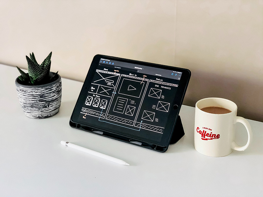
Source: https://weltio.com
Weltio limits the number of elements on each page, which makes checking for functionality easier. If your site is minimalist, you should still check that everything aligns correctly, all links work and your CTA button performs.
2. Know Your Audience
You’ve likely heard this advice about marketing and sales. You also should understand who your website is for. Know your customers and their preferences so you can choose the right color combinations to tap into their emotions.
What are their biggest fears and problems? If you can solve their pain points on your website, you’ve taken great strides toward developing a loyal customer. Create buyer personas to represent your audience segments and design to them.
3. Use Beautiful Images
Your site’s visuals can make or break the customer experience. Big hero photographs can set the tone and help highlight your product. If you offer any type of product pages, offering various angles so users can see just what they’re getting is beneficial.
The human brain processes images much faster and more efficiently than it does text alone. Use pictures to highlight your main points and to drive facts home for the viewer.

Source: https://mondocontractflooring.com
Mondo Contract Flooring utilizes photographs that show their premium rubber flooring from the exact right vantage point. Note how the majority of the image is of the floor and the other elements fade into the background. By going with a grayscale image, they keep the site minimalist looking and have plenty of negative space to add headlines and CTA buttons.
4. Stick with Traditional Features
It might be tempting to come up with a unique type of navigation bar. However, straying too far outside the norm creates confusion for some users. Rather than reinventing the will, go with what users expect. When you meet expectations, you can put the focus on what you sell.
For example, the navigation bar should almost always be near the top of the page. The CTA should be easy to find and contrast nicely with the other elements. Step back and consider if anything is confusing or needs refined to better meet user intent.
5. Check for Mobile Responsiveness
eMarketer recently reported mobile usage is up yet again. In 2021, it rose at a fast-paced 17.7%, and 4.6% in 2022. If your site isn’t ready for all those smartphone browsers, now is the time to get it there.
Ideally, your website works exactly the same on mobile as it does on a desktop computer. Images, functions and forms should adapt for a smaller screen. If you can automate any forms, so things get filled in based on what the user has already input, you can make the accessibility much better for the mobile version of your site.
6. Stick with Traditional Features
It might be tempting to come up with a unique type of navigation bar. However, straying too far outside the norm creates confusion for some users. Rather than reinventing the will, go with what users expect. When you meet expectations, you can put the focus on what you sell.
For example, the navigation bar should almost always be near the top of the page. The CTA should be easy to find and contrast nicely with the other elements. Step back and consider if anything is confusing or needs refined to better meet user intent.
7. Check for Mobile Responsiveness
eMarketer recently reported mobile usage is up yet again. In 2021, it rose at a fast-paced 17.7%, and 4.6% in 2022. If your site isn’t ready for all those smartphone browsers, now is the time to get it there.
Ideally, your website works exactly the same on mobile as it does on a desktop computer. Images, functions and forms should adapt for a smaller screen. If you can automate any forms, so things get filled in based on what the user has already input, you can make the accessibility much better for the mobile version of your site.

Source: https://webgi-jewelry.vercel.app
We really love the soft dusty rose background for the Mancini & Co. website. The design is minimalistic, so users can quickly find the CTA and scroll through the jewelry. Note how the mobile version pulls up a similar look and layout. You’ll easily recognize the brand no matter which version you own.
One thing we would do differently is to not blur out the images quite as much on the mobile version. This is an example of a fun design feature not translating as well on a smaller screen. The site still functions well and has an excellent design, but would be vastly improved with clearer images of the rings.
8. Add Content
If you want people to come to your site and stay there, you must add quality content. Think about what pain points your customers have. Answer them in articles, videos, and infographics. Once you draw people to your pages, you need something to keep them there. A nice blend of topics is one of the best ways to keep them engaged.
9. Embrace Color
Even when trends point to monochromatic color palettes, or your business hues are pale, don’t be afraid to use pops of color to grab user attention. You can add color to your CTA buttons, as accents to point users in the direction you wish to go or within your images.

Source: https://cricut.com
Cricket’s color choice is fairly monochromatic and neutral. Even the machine is a soft shade. However, they add in some attention-grabbing pops of red, yellow and purple with the display of paper flowers made from the machine.
10. Try, Test and Try Again
The best way to create a professional website users respond to is by trying different things and seeing what works best with your audience. Conduct split testing when you try a new design. See what is most effective with your audience. Over time, you’ll create a site your customers flock to and are proud to tell others to visit.
Author
Eleanor Hecks is the editor of Designerly Magazine. Eleanor was the creative director and occasional blog writer at a prominent digital marketing agency before becoming her own boss in 2018. She lives in Philadelphia with her husband and dog, Bear.