Eye-Catching Brilliance: Top Examples of Bright Landing Pages
Businesses in the market for a cheerful, eye-catching design should consider utilizing bright landing pages. Developers can know all the elements a great landing page should have, but if the plan doesn’t mesh, they wasted valuable time building something that doesn’t convert. The webpage must be more interesting than other things the user could be doing in a given moment to stand out against the competition.
Learning how to design a page that grabs attention requires a bit of thought. Designers should begin by studying some of the top examples of bright landing pages and take notes on what does and doesn’t work. Each company has its own style, so select only what seems to mesh well with the brand. Here are some favorites and why they perform so well.
1. Cut Clutter
Put the focus on the call to action (CTA) by removing unnecessary elements. Focus only on the goal of the page and the next step users should take and point them toward the action cohesively.

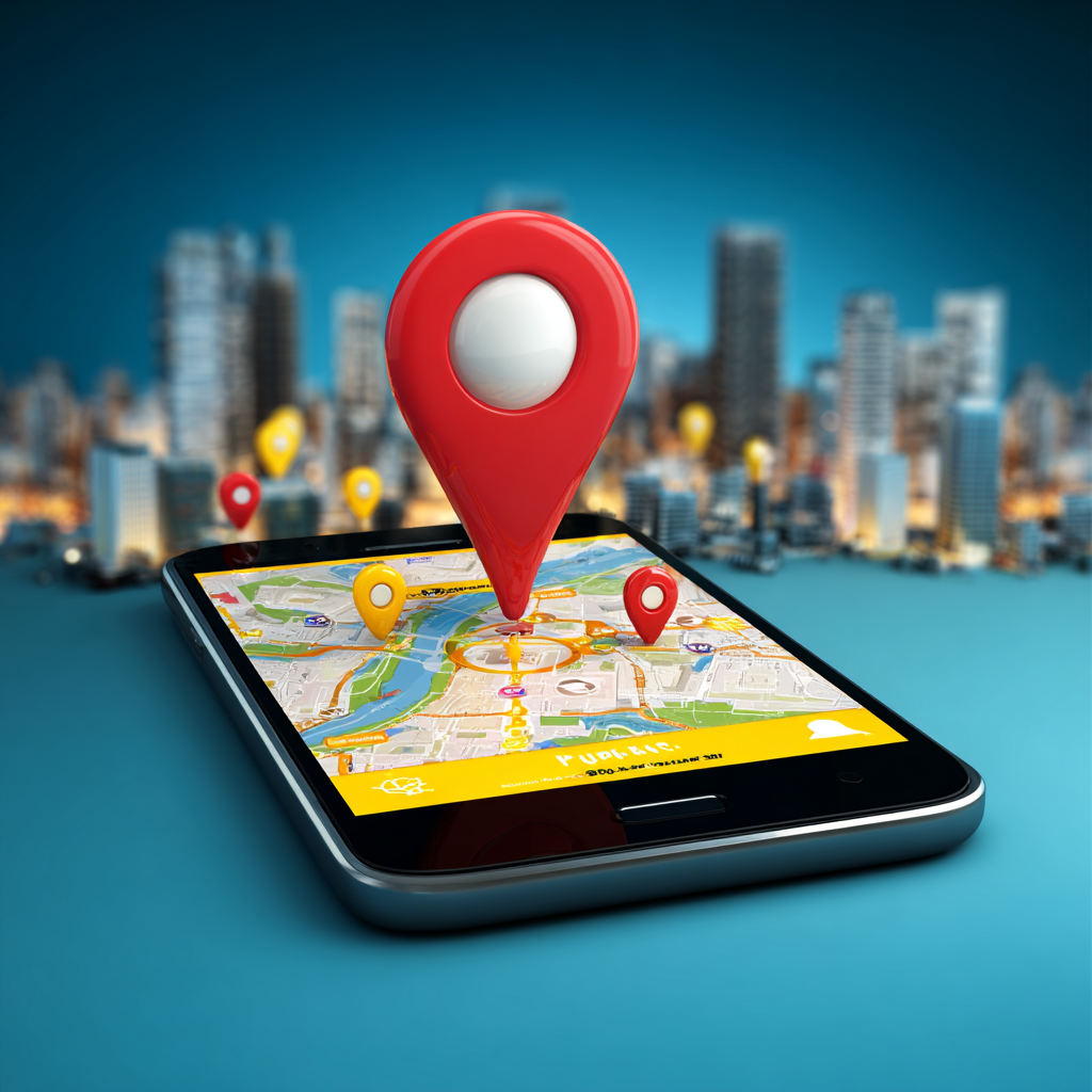
Source: https://www.airbnb.com/host/homes
Airbnb has a very simple landing page for those looking to become host homes for vacationers. It provides an interactive sliding scale of how much landlords might earn based on the number of nights booked at a standard rate for the area.
To the right is a map that shows the region and the average pricing for different neighborhoods. The white space creates a clean, crisp look that draws the focus to the CTA button to get set up.
2. Grab Attention
Bright landing pages don’t have to be filled with white. A pop of color can grab user attention and even influence mood. For example, a brand that is youthful and exciting might use fuschia. Pay attention to the color wheel and which hues complement each other. Know the typical emotions associated with each shade and choose those that drive users to convert into customers.

Source: https://odysseytestprep.com/
Odyssey Test Preparation uses bold orange and some pops of purple to attract its perfect target audience — those getting ready to take the LSATs. It keeps the design minimalistic, but the bold hues give it a different feel than the more traditional look of Airbnb’s landing page.
Note the addition of the trust factor under the CTA to give users assurance it’s a valid site that’s helped others.
3. Use Visuals
Add a professional appearance with relevant images. There’s an old saying that a picture is worth a thousand words. Humans process images better than text alone, and adding an image enhances the copy. Companies that tap into the power of a graphic to show results from the product or fill the background with an image grab attention. Adding illustrations and photographs takes the landing page design to a new level.

Source: https://www.wix.com/wix-lp/illustration
Wix has several landing pages, depending on where and how users enter the site. This one has an orange illustrated background, which is a warm color often associated with joy. Note the bright pop of blue to draw users to the single CTA on the page. There is little doubt what someone’s next action should be.
4. Adopt a Tone
Bright landing pages call for a light tone that pulls the user into the brand’s personality. Before creating a landing page, determine the brand’s mood. Officials should write a company persona that is a mock person with a running list of preferences, jokes and favorite words. Tap into the description when creating a new landing page.

Source: https://hellotushy.com/
Tushy has a simple and light-colored palette that pulls the user in. White and baby blue create a bright, sunny look that is calming and interesting at the same time. It’s a bit different than some of the earthy tones others in the same industry use.
A pop-up almost immediately appears when someone lands on Tushy’s site. The humor behind the words ties perfectly into the light, bright colors. The company invites visitors to “stay for the butt jokes.” The CTA reads “Sign My A** Up.”
The tone can easily convert those with a certain sense of humor into paying customers. Even if visitors exit out of the pop-up, they’ll be invited to shop.
5. Combine Unusual Colors
Designers who want a bright, vivid look may want to combine colors people don’t normally think of together, such as red and purple, blue and yellow, or anything that pops. Keep working with the saturation and hues by adjusting shades through online color palette generators.
Keep brand colors in mind, but if they aren’t bright enough, it’s OK to stray outside the norm for a landing page. It can have its own design without worries about the logo hues.

Source: https://emailoctopus.com/
EmailOctopus uses a soft minty green and pops of bright purple to draw users in. The octopus is at the forefront of the landing page design with the purple logo. Everything else adjusts around the accent color, and the result is bright and eye-catching. Notice the varied hues of green to create some texture in the design.
Why Are Bright Landing Pages Crucial to Success?
Businesses have just a few seconds to grab user attention. The clock starts ticking the minute they land on a page. Everything, from color choices to images to headlines to the CTA button, must be just right to engage site visitors and convert them into leads. Try adding some vivid hues to the next landing page design and see if the return on investment increases.
Eleanor Hecks is the editor of Designerly Magazine. Eleanor was the creative director and occasional blog writer at a prominent digital marketing agency before becoming her own boss in 2018. She lives in Philadelphia with her husband and dog, Bear.