The Best Website Design Trends for Service-Based Businesses
Your service website wins more clients when you lead with clarity-first messaging that says who you help and the outcome you deliver, then back it up with human photos, a conversational voice, and bios near key insights. You’ll place proof where decisions happen—testimonials by pricing, case studies near packages—and keep one dominant CTA per section. Add AI chat for instant answers, personalize CTAs, and hit sub‑3‑second mobile speed with WCAG AA accessibility. Next, you’ll see how to apply each trend.
Service Website Design Trends That Win Clients
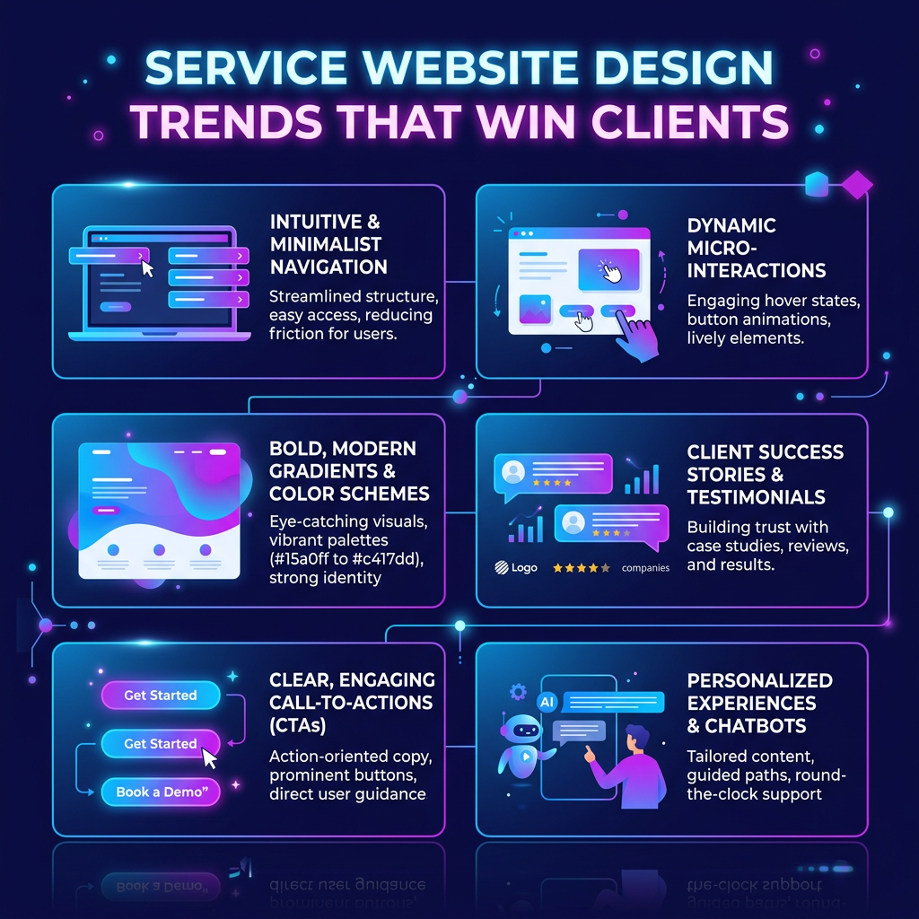
Why do some service websites turn curious visitors into booked calls in minutes while others lose them in seconds? You win by stacking six trends that reward decisive buyers: lead with authentic storytelling, real photos, and a natural voice that signals you’re human. Make every section scannable with tight headings, bullets, and a ruthless visual hierarchy. Add trust-building proof fast—testimonials, case studies, accreditations, and FAQ blocks that read cleanly for humans and AI. Engineer speed and mobile-first performance so pages load under three seconds, with a clean, accessible WCAG AA design. Use bold typography, scroll-based storytelling, and organic layouts to keep momentum. Then keep power in your hands: differentiate with immersive visuals, strategic partnerships, and nonstop experimentation that raises conversion rates.
Start With a Clarity-First Service Website Message
Lead with clarity, and you’ll earn attention fast: your homepage header should instantly say who you help and the outcome you deliver, then back it up with a scannable subhead and bullets that answer “what is this?” in five seconds. In 2026, vague taglines lose deals; precise promises win.
Keep each section action-driven, with one dominant CTA—book a consult, request a quote, or start a call—so visitors never have to guess the next step. Place trust signals right where decisions happen: testimonials beside service packages, case studies near pricing, and accreditations next to your form. Use bold typography and clean layouts to guide the eye, not distract it. On Squarespace or any platform, stay speed-obsessed—sub‑3‑second loads on mobile protect conversions, especially in the UK market.
Make Your Service Website Feel Human (Photos, Bios, Voice)
Trust travels faster than polish: when your service website shows real faces, a clear “why,” and a voice that sounds like you, visitors feel safe taking the next step. Swap sterile, AI-flat copy for a conversational tone that mirrors how you speak. Ask sharp questions, answer them quickly, and keep every line focused on booking or requesting a consult. Use bright, smiling photos of you and your team, not stock fillers. Put them near high-intent moments—service pages, pricing, and your main CTA—so people feel they’re hiring a human, not a template. Add bios that connect to authored insights and process walkthroughs. That personal branding lifts expert visibility, signals leadership, and turns curiosity into confident action.
Bio Example Page:
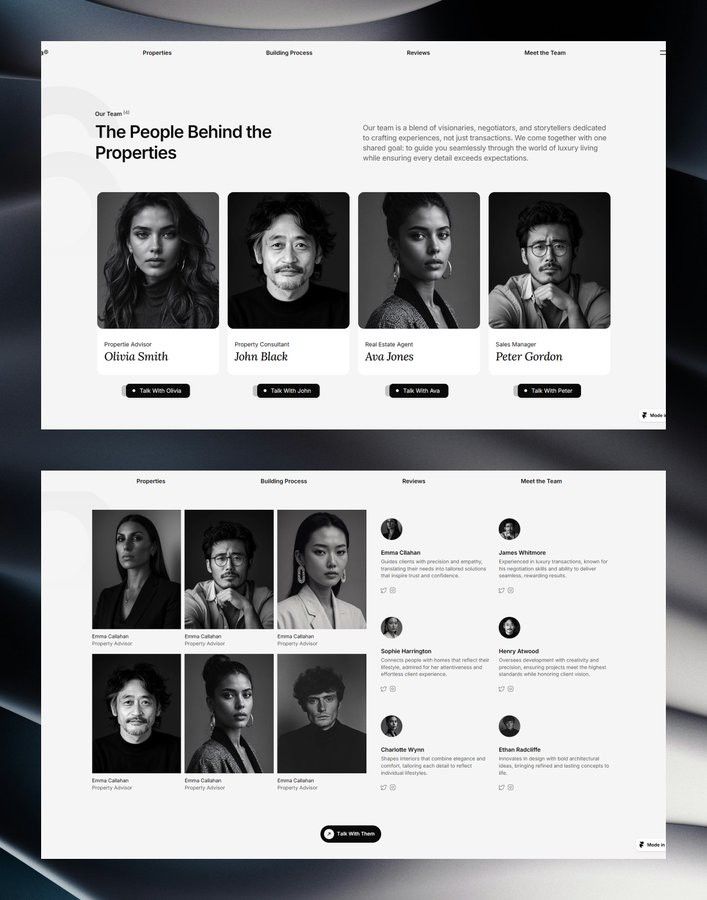
Image Credit – https://www.pinterest.com/pin/193795590210687116/
Build Trust on Your Service Website With Proof
Even if your services are excellent, visitors won’t book until they see proof you deliver. Put testimonials and embedded reviews (Google, Trustpilot) right beside pricing, packages, and your booking CTA so confidence hits at the exact moment of choice. Keep quotes specific, outcome-driven, and tied to the service shown.
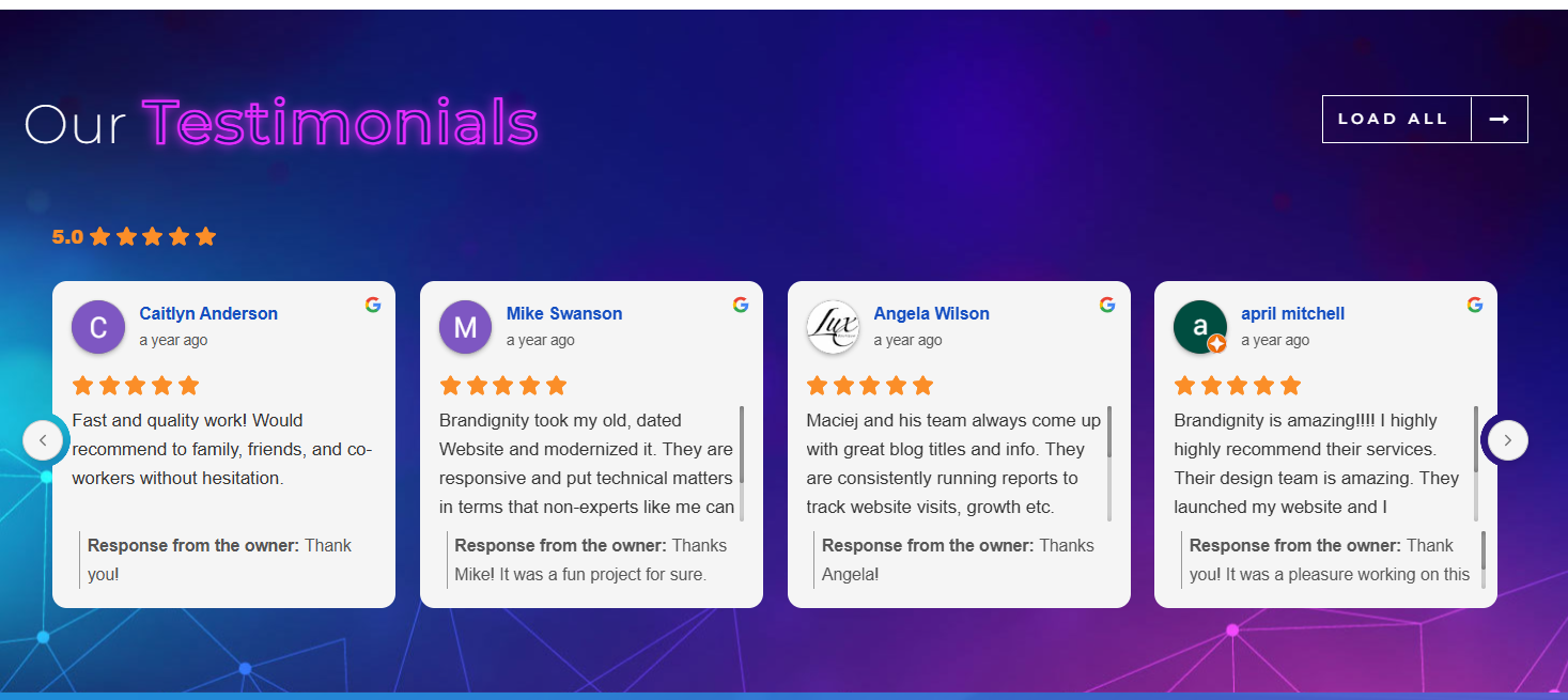
Back them up with case studies that flex your edge: the problem, your process, the timeline, and measurable results. Use bold headings and short paragraphs so skimmers—and search and summary tools—grab the value fast. Add accreditations, certifications, and industry standards where they matter, not buried in a footer. Finally, swap stock shots for real team photos and authentic project imagery. Proof turns interest into decisive action, now.
Add AI Support That Answers Questions and Personalizes
Why make prospects dig for answers when AI can deliver them instantly? Add AI-powered chat and intelligent search that surface the right service details, pricing ranges, timelines, and next steps based on what someone clicks, reads, and asks. You’ll remove hesitation and keep momentum moving toward a consult request.
Use personalization to adapt your site in real time: show location-specific availability, swap testimonials by industry, and trigger adaptive CTAs that match intent—“Book a strategy call” for high-intent visitors, “Get a quote” for comparison shoppers. AI tools also streamline content updates, so your guidance stays current without bottlenecks. Track the questions people ask and the paths they take, then reshape navigation and offers to drive sharper conversions while respecting privacy.
Improve Mobile Speed With Core Web Vitals
How fast does your site feel on a phone when a prospect’s ready to book? In a mobile-first world, speed is authority. Core Web Vitals reward fast loading, snappy interactivity, and rock-solid visual stability, and Google treats them as ranking signals—so performance becomes a competitive edge. Aim for pages that load in under 3 seconds, respond instantly, and don’t jump around while users read. Power up results by using web-optimized fonts, compressing images under 200KB, lazy loading below-the-fold media, and cutting render-blocking scripts and CSS. Then keep pressure on: monitor with PageSpeed Insights, ship iterative fixes, and stay inside favorable thresholds. When your site feels effortless, prospects trust you faster and convert with confidence.
Create Frictionless Booking Flows That Boost Inquiries
A frictionless booking flow turns interest into inquiries by keeping your call-to-action visible, your steps minimal, and your path to “schedule” unmistakably clear. Put persistent CTAs on key pages and compress the journey into one decisive sequence: pick a service, choose a time, confirm. Use personalization to accelerate intent—when someone returns, surface the most relevant case study or offer so they don’t hunt. Add an AI chatbot that answers objections, routes leads, and opens real-time scheduling to lock in conversion before momentum fades. Keep load times under three seconds and design mobile-first, so thumbs can book instantly. Reinforce trust right inside the flow with testimonials, accreditations, and transparent next steps.
- Sticky CTA + single-page scheduler
- Personalized revisit paths
- Chat-assisted scheduling
Use Bold Typography + Scrollytelling to Drive Bookings
Where does your visitor’s attention land first when they hit your homepage? Make it your strongest promise, delivered with bold typography that builds instant hierarchy and points straight to the primary CTA. Use oversized headlines with a single clean supporting font, so your offer scans quickly on mobile and your value hits hard.
Then deploy scrollytelling to keep them moving toward “Book now.” Start with a top-line statement, and let each scroll reveal proof, process, and outcomes—step by step, visually reinforced and easy to digest. Pair bold type with minimal layouts and tight copy so comprehension stays immediate and momentum never drops. When your story unfolds in sequence, you control the narrative, remove doubt, and convert attention into bookings.
Meet WCAG AA Accessibility on Your Service Website
Why let a single design choice block a qualified lead from booking with you? WCAG AA accessibility turns your site into a high-performing gateway: more usable for everyone, easier to trust, and cleaner for search engines to crawl. When prospects can’t read, navigate, or understand your pages fast, they bounce—along with revenue you’ve already earned.
- Hit 4.5:1 color contrast for body text, and offer an optional dark mode to reduce glare.
- Make every key action keyboard-friendly; test booking flows with the Tab key.
- Write descriptive alt text so screen readers translate your visuals into value.
These upgrades are quick wins on Showit and beyond. You don’t just meet compliance—you command attention, remove friction, and convert with confidence.
Conclusion
If you want more booked calls in 2026, your website can’t just look modern—it must remove doubt fast. Start with a clarity-first message, then back it up with human photos, real proof, and WCAG AA accessibility. Add AI that answers questions instantly, personalize the path to the right service, and keep pages lightning-fast for mobile. One stat to picture it: a 1-second delay can cut conversions by 7%. Keep it frictionless, and you’ll win.